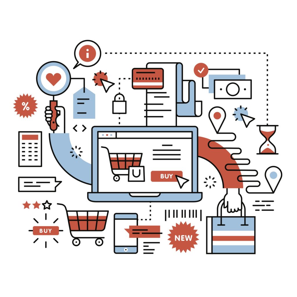
A positive user experience with the first-impression elements of your site (navigation, homepage, mobile-friendly version) will lead users to further explore your products or services and, hopefully, become customers. Optimized UX of every step of the purchase cycle will not only lead to new customers, but loyal customers who will return to your site over and over.
Products & Services
1. Personalization and customization. One way to personalize your site is to provide a “Customers also viewed…” section showing the products that similar users viewed or purchased. Site personalization can result in users spending more than planned. Giving users the opportunity to customize the information that is displayed, and how it’s displayed, when visiting your site is another way to make UX more personal to users.
2. Provide search bars, categories, filters, rankings. In addition to a site menu in your site’s header, provide a search bar where customers can jump directly to a particular product. Products should also be listed and organized into categories and subcategories (determined by your target audience) to make searches more streamlined. Provide users with the option to filter through your products to explore a particular category (e.g., specific colors or sizes). Allowing users to organize products by ranking (e.g., newest, most popular, lowest price, most relevant) is another way to let users quickly get to the products they’re most interested in.
3. Product presentation. Product presentation includes product images and descriptions. Images of your products should be high quality and quickly uploaded, as 39% of users will leave your site if images take too long to load. Images should offer a variety of angles, enlarge on hover, display alternative options (e.g., different colors), and suggest alternative products if sold out. In-scale imagery should also be provided so that users can gauge a product’s actual size. Product descriptions should include details about availability and hidden fees early on (versus providing this information at checkout, where they risk 55% of users abandoning their shopping cart altogether).
Customer Reviews
1. Customer feedback. Transparency builds trust. Feedback from customers who have already purchased a product can be the determining factor between buying or skipping over a product with 63% of shoppers being more likely to purchase a product with reviews. Therefore, feedback should be located near the product description so users have more information to make an informed decision.
2. Video and photo reviews from users. Providing a platform for current customers to share their experience using video/photos increases transparency further because customers often reveal their identity along with their endorsement of the product. This not only builds trust of your site but also among potential users and current users.
Transactions
Shopping Carts
List shopping cart items so that users can see what’s in their cart simply by hovering over the cart icon. The same list should appear when users click on their cart, with options to change products (e.g., size, amount, save or delete) without having to return to shopping. Switching between shopping and the cart should be seamless. Carts should be accessible from different devices and available for a certain period of time.
Checkout
1. Easy checkout and saved account info. Checkout CTA buttons should be easy to find without scrolling and searching. Button copy should clearly communicate where users are in the purchasing cycle. Checkout doesn’t necessarily have to all exist on the same page but the process should be streamlined. The more time users have to spend entering their information, the more likely they will abandon their cart. The most efficient checkout process is in three stages, over three pages: shipping/billing/payment > summary and confirmation > receipt. Giving users the option to save their account information will make future checkouts easier.
2. Guest checkout. 34% of customers will abandon their cart if guest checkout isn’t available. For new users and users who are not yet loyal customers, the option to check out as a guest (i.e., without registering or creating an account). This makes the purchasing process quick and easy without requiring further commitment.
3. Shipping information. Information regarding the cost of shipping, reason for the cost, options to speed up delivery, taxes, fees, and estimated product arrival date should be provided before payments are finalized. Users don’t feel they were tricked into buying a product they might not see for three weeks.
4. Secure payment and customer support. Because users are trusting you with sensitive information, they must feel secure in doing so. Displaying trust seals/badges along with confidentiality disclaimers helps users feel like your site will handle their information properly. Offer a variety of payment options and the opportunity to review an order before submitting payment so that users don’t feel rushed when providing sensitive information. Follow up with an automatic confirmation email with details about estimated delivery, package tracking, and customer service contact information.
Summary
The number of tips and tricks for improving the UX of your ecommerce site may seem overwhelming, but implementing and testing these elements as early as possible in the design stage are worth the resources you will save in the long run.